
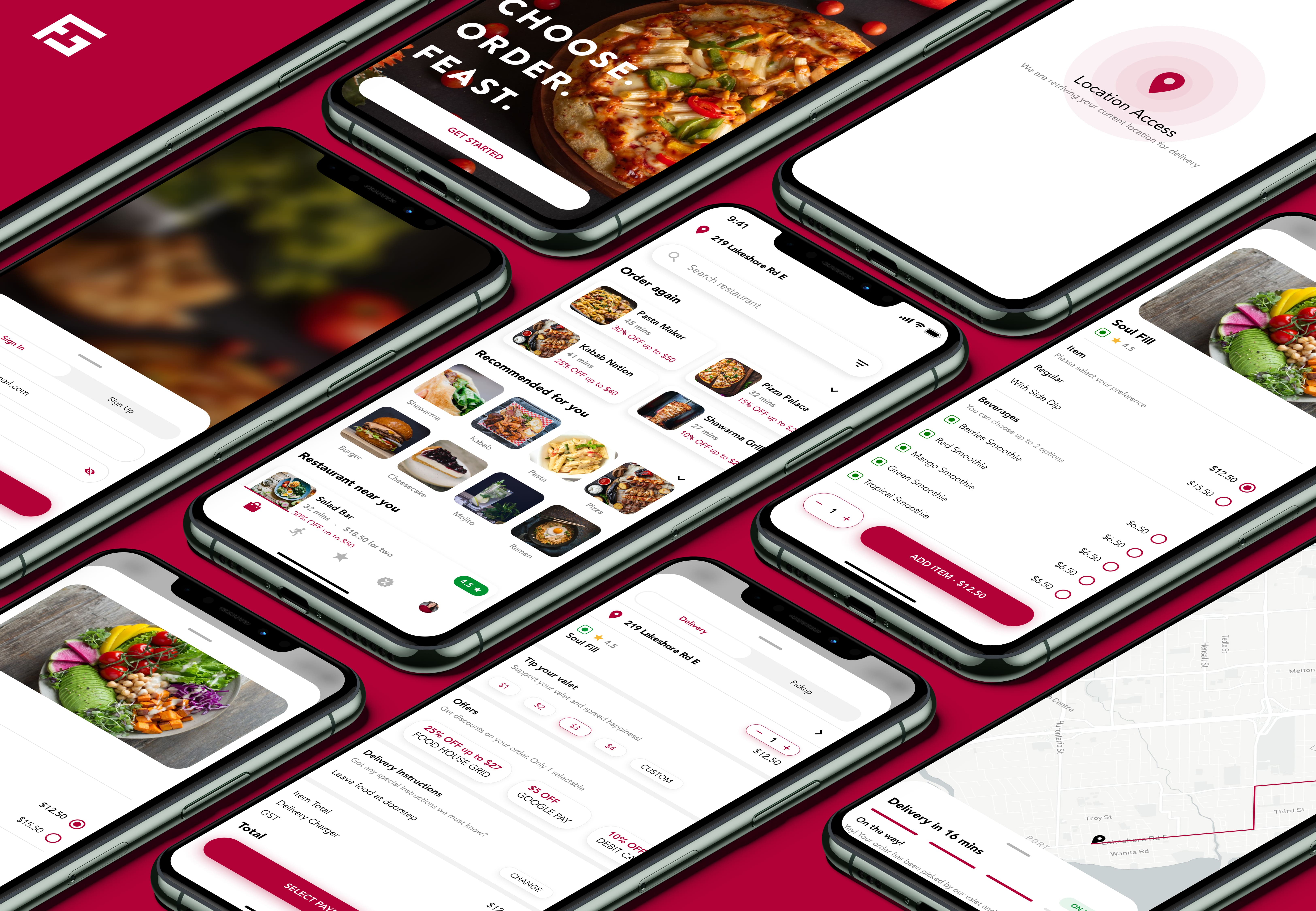
Food Service App
"Food Grid House" is a last mile food delivery app aimed to make food ordering and delivery more intuitive and easy.
Timeline
2 weeks
Year
2018
Role
UX / UI Designer
Tools
Figma
Problem Statement
Users don't get cuisine recommendations based of their taste and need an option to pickup food rather than get it delivered.
How Might We…
How might we recommend meals and cuisine based on user's taste and enable them to pickup food?
Goal
Design an intuitive experience that gives user based restaurants and food suggestions and lets the user choose 'pickup' as an option
Process
Discover
Conducted user research with methods like contextual inquiry and customer interviews to understand their pain points and needs.
Define
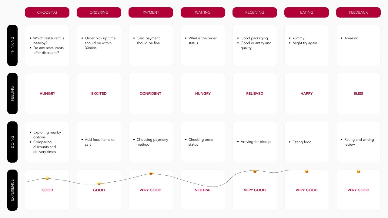
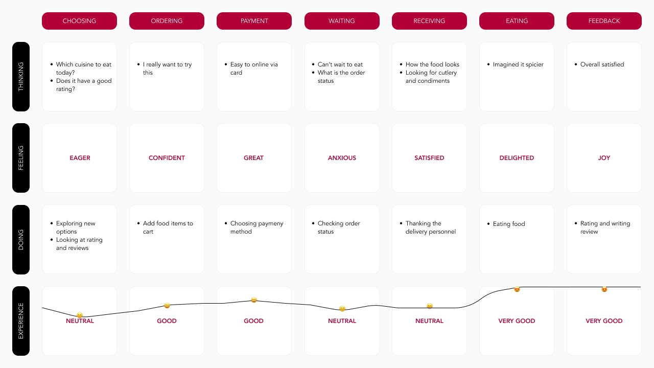
Created user personas and customer journey map to identity where the users were poorly served or stressed during the journey to provide improvement opportunities.
Design
Created low-fi wireframes and conducted usability testing to make improvements.
Deliver
Iterations were done to the wireframe to make the interaction more comprehensive .
Discover
User research: summary
I conducted two user interviews. In order to get a broader perspective, I interview two different genders with a significant age gap, personality and lifestyle. I assumed the the young lad would be ordering food more often and the wise lady would mostly be cooking homemade meals but in reality it was the opposite
User research: pain points
Recommendations
Paid-promotions lead to incorrect results that user might be looking for. Recommendations should be more organic, based on user's order history.
Filtering Options
No filtering option is given cuisine/distance/prince etc. Users should have the ability to filter their search options based on their needs.
Real-Time Location
Landing page always defaults with the 'home' address since it's saved. Location could instead be fetched in real-time to get user's delivery address.
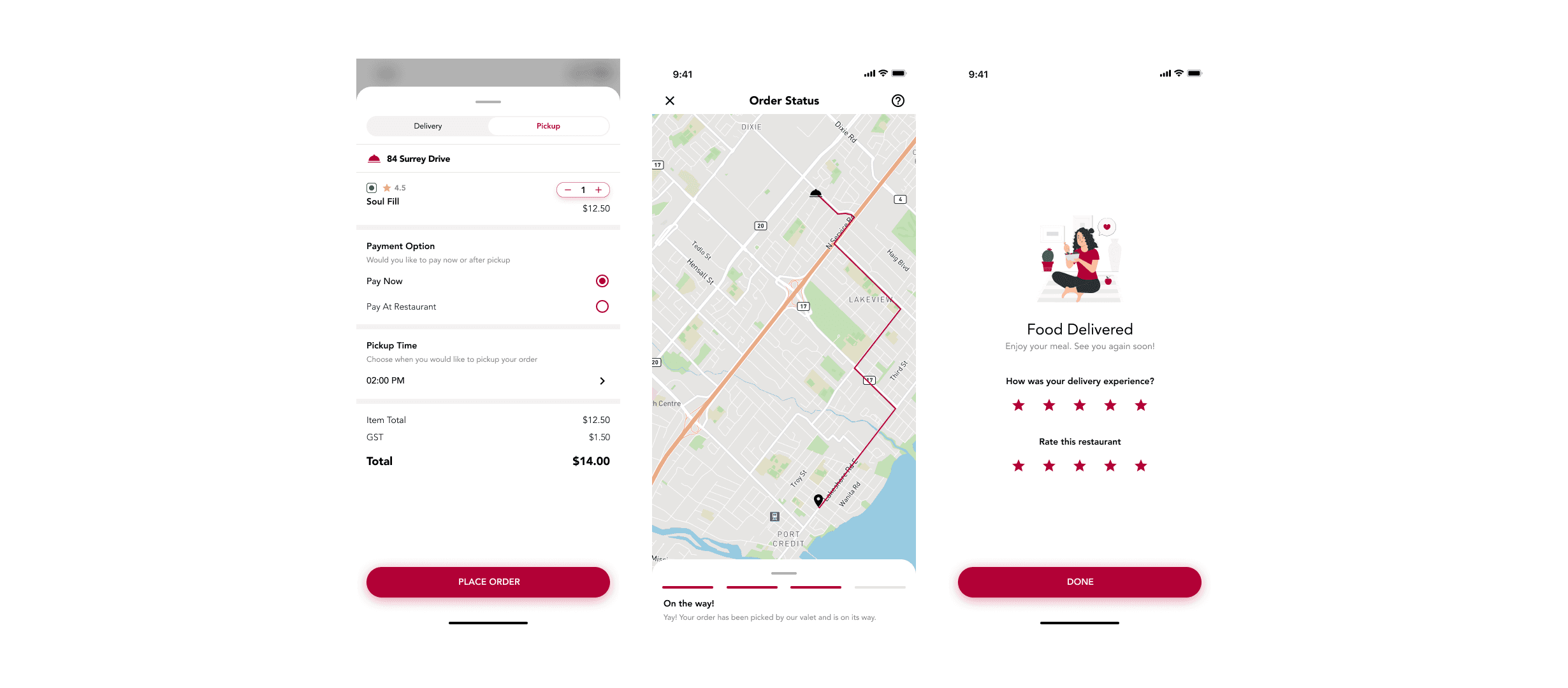
Pickup Facility
Pickup option can be provided to the use to save delivery cost and order status can be shows to pickup food at a precise time
Define
User persona: Jonathan Licari
Problem statement
Jonathan is a young working professional who needs to pickup food because he wants to save money.
How might we
How might we help Jonathan better search for restaurants near him so that he can save money on delivery.
User persona: Anushree Goyal
Problem statement
Anushree is an experienced entrepreneur who needs to experience different cuisines because she interacts and meets a lot of diverse people.
How might we
How might we better recommend Anushree restaurants options, so she can experience more cuisines.

Design
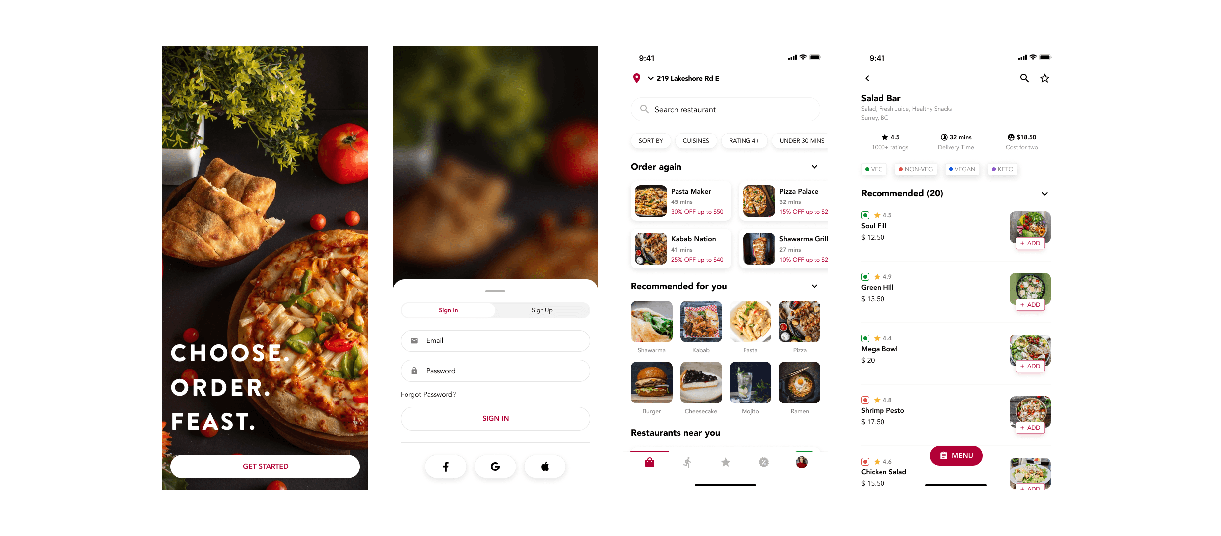
Wireframes
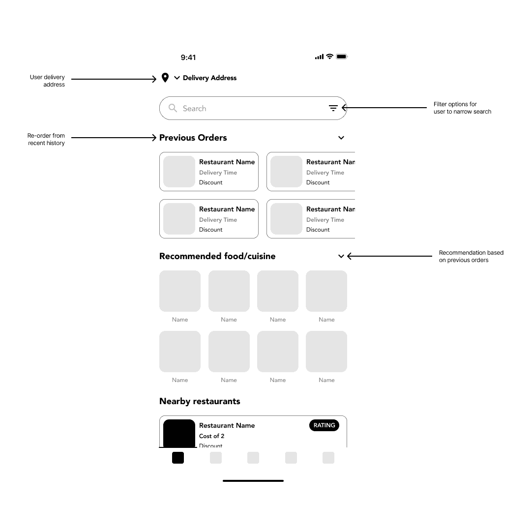
Home delivery
User should be easily able to identify the delivery address, filter out food options, view any previous order and get food recommendations.
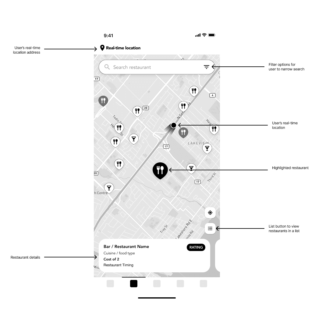
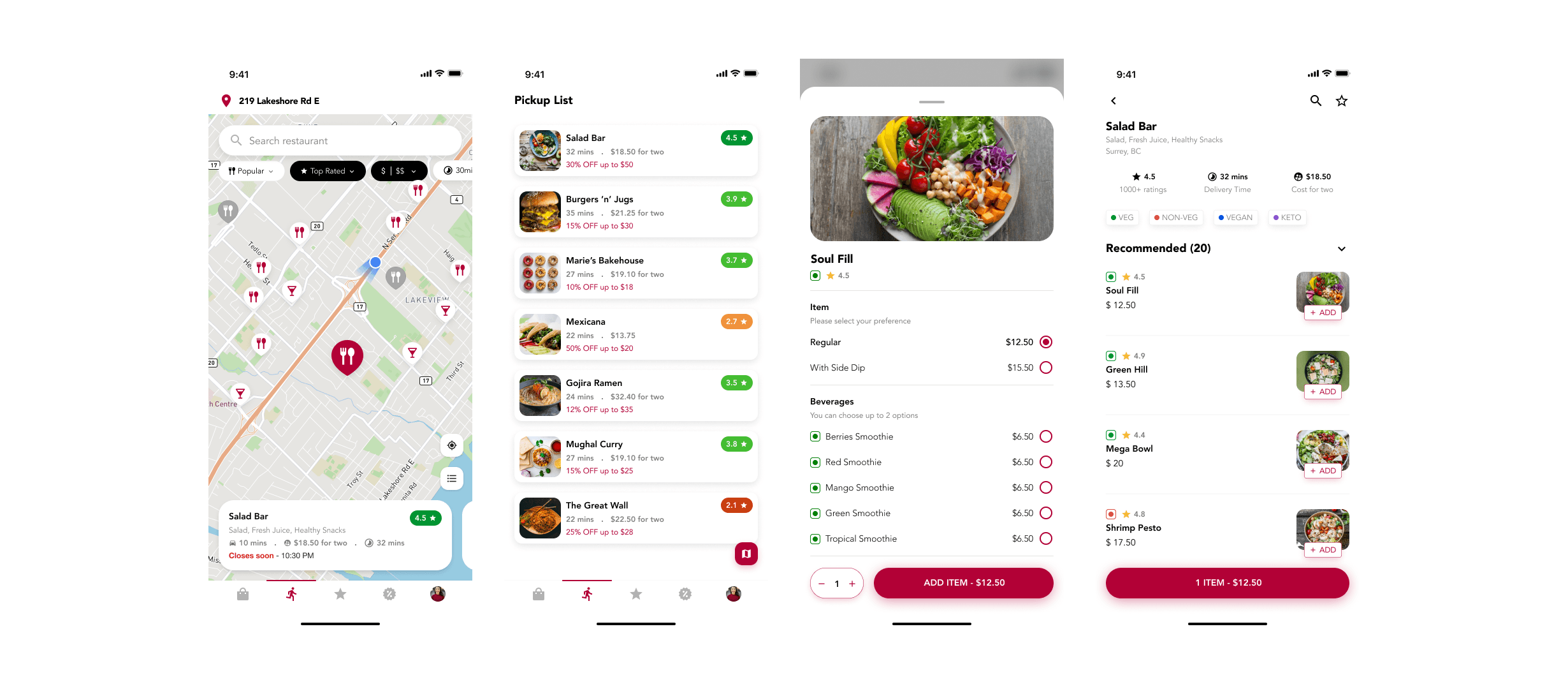
Pickup
User should be able to view all the nearby restaurants on a map near their real-time location. Restaurants cards should contain basic but valuable information about restaurant.
Usability study: findings
Usability study was conducted with specific task to observe their experience on performing actions to compare the goal and what the outcome was.
Round 1 findings
Switching screen for filters
No delivery/prep time displayed
Nearby restaurants results was useful
Round 2 findings
Quick filter helped make faster decisions
Est. delivery/prep time reduced anxiety
Nearby restaurants results was useful
Deliver
Mockups
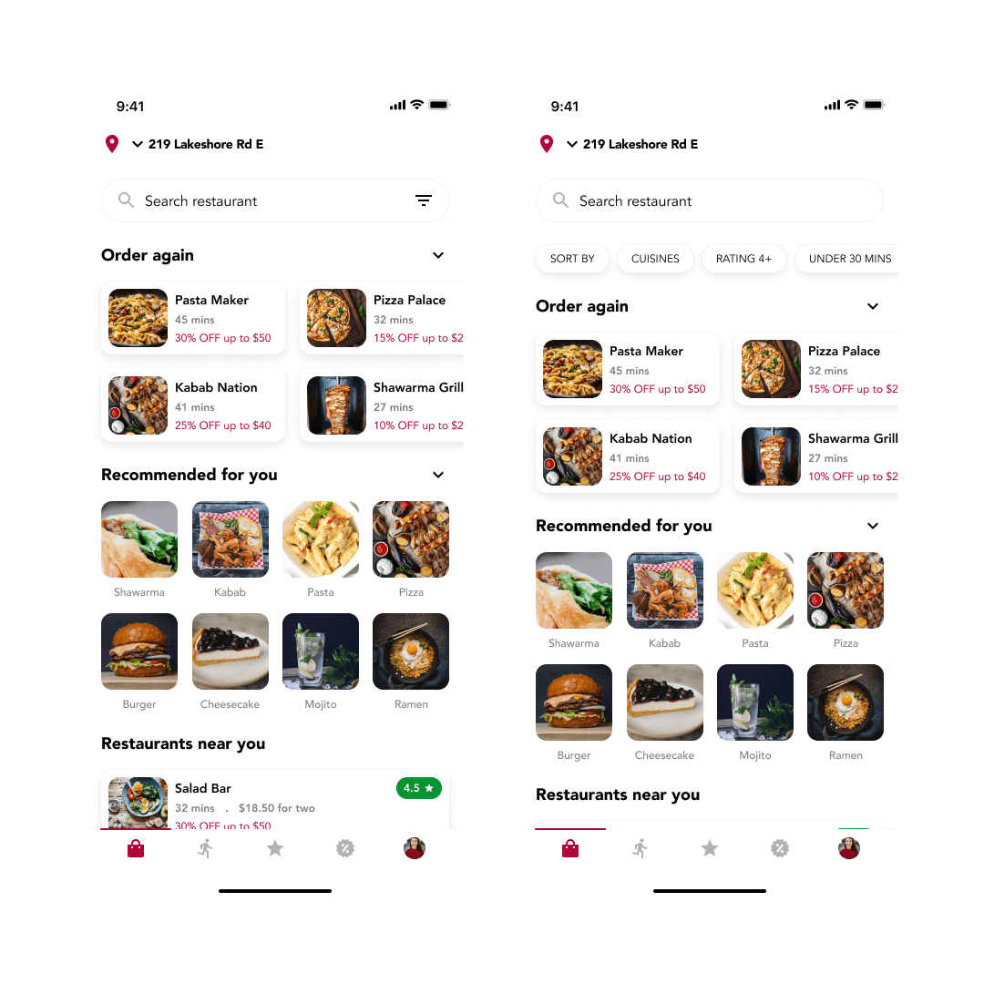
Filtering
User was previously shows a different screen for filter options and had to switch screen to change their decisions. Now the user can access filter quickly on the same screen and view the applied filters.
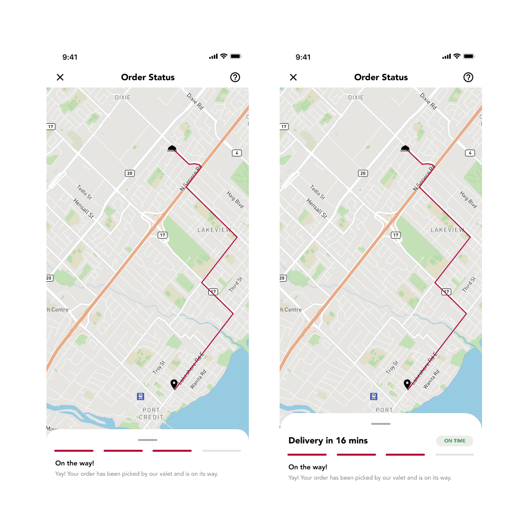
Delivery
User wasn't sure of the delivery time since the order was placed. After redesign, user found it useful to know the it would take to receive their order.
Usability study: findings
Usability study was conducted with specific task to observe their experience on performing actions to compare the goal and what the outcome was.
Round 1 findings
Switching screen for filters
No delivery/prep time displayed
Nearby restaurants results was useful
Round 2 findings
Quick filter helped make faster decisions
Est. delivery/prep time reduced anxiety
Nearby restaurants results was useful
Mockups
Accessibility considerations
Navigation
All 'call to action' buttons are clearly marked and have been placed at the bottom as floating buttons so the user can easily perform the main action in a step and head to the next step.
Icons
An icon representing a particular feature ro function is vital since people visualise and remember pictures faster than words.
Mic
For delivery instructions, recording a message can be more useful since people speak different languages and having different dialects, and verbal instructions may be easier to comprehend
Takeaways
Impact
Food Grid House app enables user to order and get food deliver home, order food and pickup at the restaurant. It also shows recommendations based on the historical orders made by a user.
What I learned
It's important to understand high-level use cases of the product and start with a basic workflow.
Next steps
Offers and discounts
Display best offers and discounts for users to use and engagement more with the platform.
Subscription
Subscription base model can be introduced so users can get better discounts and the business gets recurring returns.
Wallet
Introduce wallet so user can load money into the app wallet and all the transactions can be done from it.